使用matplotlib结合miniQMT终端调用xtquant中的xtdata对证券的tick数据可视化图形展示的DEMO
PTD
阅读:3904
2025-11-19 15:39:34
评论:0

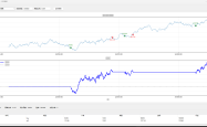
将证券的tick走势图转换成图标并显示出来的方法:
# -*- coding: utf-8 -*-
import xtquant.xtdata as xtdata
import matplotlib.pyplot as plt
import pandas as pd
import numpy as np

# 设置中文字体
plt.rcParams['font.sans-serif'] = ['SimHei']  # 用来正常显示中文标签
plt.rcParams['axes.unicode_minus'] = False  # 用来正常显示负号

# 定义ETF基金的代码
etf_code = '513310.SH'
period = 'tick'
start_time = '20251119'
end_time = ''

# 1. 下载历史数据到本地
xtdata.download_history_data(etf_code, period=period, start_time=start_time, end_time=end_time)

# 2. 获取本地历史数据
history_data = xtdata.get_local_data(
    field_list=[],
    stock_list=[etf_code],
    period=period,
    start_time=start_time,
    end_time=end_time,
    count=-1,
    dividend_type='none',
    fill_data=True
)

# 3. 获取最新的全推数据
latest_tick_data = xtdata.get_full_tick([etf_code])

# 处理历史数据
if etf_code in history_data:
    df = history_data[etf_code].copy()

    # 提取索引中的时间部分作为横坐标(格式:HHMMSS)
    df['time_str'] = df.index.astype(str).str[-6:]  # 提取最后6位作为时间

    # 过滤掉价格为0的数据(可能是开盘前的数据)
    df = df[df['lastPrice'] > 0]

    print(f"数据时间范围: {df['time_str'].iloc[0]} - {df['time_str'].iloc[-1]}")
    print(f"价格范围: {df['lastPrice'].min():.3f} - {df['lastPrice'].max():.3f}")

# 创建图表
fig, ax = plt.subplots(figsize=(16, 8))

# 绘制价格走势图
if etf_code in history_data and len(df) > 0:
    # 使用索引时间作为横坐标
    x_ticks = range(len(df))

    # 绘制价格走势线
    ax.plot(x_ticks, df['lastPrice'], linewidth=1.5, color='blue', alpha=0.8, label='价格')

    # 标记最高点和最低点
    max_price_idx = df['lastPrice'].idxmax()
    min_price_idx = df['lastPrice'].idxmin()
    max_price_pos = df.index.get_loc(max_price_idx)
    min_price_pos = df.index.get_loc(min_price_idx)

    ax.scatter(max_price_pos, df.loc[max_price_idx, 'lastPrice'], color='red', s=80, zorder=5, label='最高点')
    ax.scatter(min_price_pos, df.loc[min_price_idx, 'lastPrice'], color='green', s=80, zorder=5, label='最低点')

    # 标记开盘和收盘点
    ax.scatter(0, df['lastPrice'].iloc[0], color='orange', s=80, zorder=5, label='开盘')
    ax.scatter(len(df)-1, df['lastPrice'].iloc[-1], color='purple', s=80, zorder=5, label='收盘')

    # 设置标题和标签
    ax.set_title(f'{etf_code} Tick数据价格走势图 - {start_time}', fontsize=16, fontweight='bold')
    ax.set_ylabel('价格', fontsize=12)
    ax.set_xlabel('时间 (HHMMSS)', fontsize=12)
    ax.grid(True, alpha=0.3)
    ax.legend()

    # 设置x轴刻度 - 选择一些关键时间点显示
    num_ticks = min(15, len(df))  # 最多显示15个时间点
    step = max(1, len(df) // num_ticks)

    selected_indices = range(0, len(df), step)
    selected_times = [df['time_str'].iloc[i] for i in selected_indices]

    ax.set_xticks(selected_indices)
    ax.set_xticklabels(selected_times, rotation=45)

    # 添加价格区间标注
    price_range = df['lastPrice'].max() - df['lastPrice'].min()
    ax.text(0.02, 0.98, f'价格区间: {df["lastPrice"].min():.3f} - {df["lastPrice"].max():.3f}\n波动幅度: {price_range:.3f} ({price_range/df["lastPrice"].min()*100:.2f}%)',
            transform=ax.transAxes, verticalalignment='top',
            bbox=dict(boxstyle='round', facecolor='wheat', alpha=0.8))

# 显示最新全推数据信息
if etf_code in latest_tick_data:
    latest_data = latest_tick_data[etf_code]
    latest_price = latest_data['lastPrice']
    latest_time = latest_data['timetag']

    # 在图表上方显示最新数据
    fig.suptitle(f'实时数据 - 时间: {latest_time} | 最新价: {latest_price:.3f} | '
                f'开盘: {latest_data["open"]:.3f} | 最高: {latest_data["high"]:.3f} | '
                f'最低: {latest_data["low"]:.3f} | 昨收: {latest_data["lastClose"]:.3f}',
                fontsize=12, y=0.98)

plt.tight_layout()
plt.show()

# 打印统计信息
print("\n=== 数据统计 ===")
if etf_code in history_data and len(df) > 0:
    print(f"数据点数: {len(df)}")
    print(f"开盘价: {df['lastPrice'].iloc[0]:.3f} (时间: {df['time_str'].iloc[0]})")
    print(f"最高价: {df['lastPrice'].max():.3f} (时间: {df.loc[df['lastPrice'].idxmax(), 'time_str']})")
    print(f"最低价: {df['lastPrice'].min():.3f} (时间: {df.loc[df['lastPrice'].idxmin(), 'time_str']})")
    print(f"收盘价: {df['lastPrice'].iloc[-1]:.3f} (时间: {df['time_str'].iloc[-1]})")
    price_change = df['lastPrice'].iloc[-1] - df['lastPrice'].iloc[0]
    change_percent = (price_change / df['lastPrice'].iloc[0]) * 100
    print(f"涨跌: {price_change:+.3f} ({change_percent:+.2f}%)")
    print(f"价格波动幅度: {df['lastPrice'].max() - df['lastPrice'].min():.3f}")

if etf_code in latest_tick_data:
    print(f"\n实时数据时间: {latest_tick_data[etf_code]['timetag']}")
    print(f"实时最新价: {latest_tick_data[etf_code]['lastPrice']:.3f}")
主要修改内容:
简化图表结构:
- 只保留一个价格走势图
价格走势图增强:
- 使用更粗的线条提高可视性
- 标记最高点、最低点、开盘点和收盘点,并使用不同颜色区分
- 添加图例说明各个标记点的含义
- 在图表左上角添加价格区间和波动幅度信息
横坐标处理:
- 使用索引中的时间部分(如”092502”)作为横坐标标签
- 自动计算合适的刻度间隔,避免标签重叠
统计信息更新:
- 显示每个关键价格点对应的时间
- 计算并显示价格波动幅度
本文由 海星量化研究所 作者提供,转载请保留链接和署名!网址:https://qmt.hxquant.com/?id=54
声明
1.本站原创文章,转载需注明文章作者来源。 2.如果文章内容涉及版权问题,请联系我们删除,向本站投稿文章可能会经我们编辑修改。 3.本站对信息准确性或完整性不作保证,亦不对因使用该等信息而引发或可能引发的损失承担任何责任。