使用QMT客户端获取xtquant链接xtdata数据,画K线图
PTD
阅读:8137
2025-04-24 11:15:41
评论:0
📊 使用XTQuant和Plotly绘制交互式K线图教程
1️⃣ 环境准备
# 必需库安装(建议Python 3.11)
pip install  pandas plotly
2️⃣ 核心代码解析
🔍 数据获取模块
# 设置股票和时间参数
stock_code = '600519.SH'  # 茅台股票代码
start_time = '20250101'   # 回测开始日期
end_time = time.strftime('%Y%m%d')  # 当前日期
period = "30m"  # 30分钟线

# 获取交易日历(自动过滤非交易日)
trading_dates = xtdata.get_trading_dates("SH", start_time, end_time)
📈 数据下载与处理
# 下载历史数据(首次运行需下载)
xtdata.download_history_data(stock_code, period, start_time, end_time)

# 获取本地数据
res = xtdata.get_local_data(
    stock_list=[stock_code],
    period=period,
    start_time=start_time,
    end_time=end_time
)
🧹 数据清洗关键步骤
# 转换为DataFrame并处理索引
df = res[stock_code]
df.index = pd.to_datetime(df.index)  # 确保时间索引格式正确

# 强制校验数据完整性
required_columns = ['open', 'high', 'low', 'close', 'volume']
if not all(col in df.columns for col in required_columns):
    raise ValueError(f"缺失关键列: {[col for col in required_columns if col not in df.columns]}")
3️⃣ 可视化实现
🕯️ K线+成交量组合图
fig = go.Figure()

# 主图:K线
fig.add_trace(go.Candlestick(
    x=df.index,
    open=df['open'],
    high=df['high'],
    low=df['low'],
    close=df['close'],
    increasing_line_color='red',  # 阳线颜色
    decreasing_line_color='green' # 阴线颜色
))

# 副图:成交量
fig.add_trace(go.Bar(
    x=df.index,
    y=df['volume'],
    yaxis='y2',  # 关键:使用次坐标轴
    marker_color='rgba(0,0,255,0.5)'
))
🎨 图表布局
fig.update_layout(
    # 双Y轴布局
    yaxis=dict(domain=[0.35, 1]),  # K线占65%高度
    yaxis2=dict(domain=[0.05, 0.25]), # 成交量占20%高度

    # 智能X轴显示
    xaxis=dict(
        type='category',
        rangeslider=dict(visible=False)  # 隐藏默认滑块
    ),

    # 响应式时间格式
    xaxis_tickformat='%H:%M\n%Y-%m-%d' if period.endswith(('m','h')) else '%Y-%m-%d'
)
4️⃣ 输出图形
# 交互式展示
fig.show()

# 自动保存并打开HTML
fig.write_html("kline.html")
webbrowser.open("kline.html")  # 系统默认浏览器打开
💡 高级技巧
- 周期切换:修改
period参数快速切换1m/1d等不同周期 - 多股对比:在
stock_list中添加多个股票代码 - 指标叠加:用
fig.add_trace()添加MA/BOLL等指标线
⚠️ 常见问题
- 数据下载失败:检查
xtquant账号权限 - 无法获取数据:确认已经开启或者登录miniqmt终端
- 显示乱码:确保系统支持中文显示
- 成交量不显示:检查
yaxis='y2'参数
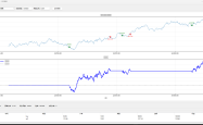
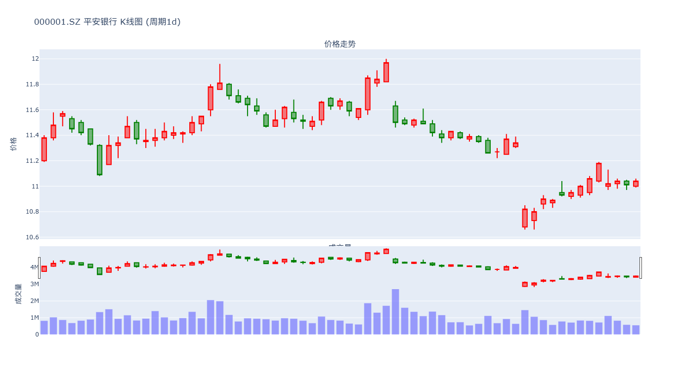
5️⃣ 效果展示
6️⃣ 完整代码
# -*- coding: utf-8 -*-
from xtquant import xtdata
import pandas as pd
import webbrowser
import plotly.graph_objects as go
import time

# 设置股票代码和时间范围
stock_code = '600519.SH' # .SH 上海,.SZ 深圳 .BJ 北京
#stock_code = '000001.SZ'
start_time = '20250101'
end_time = time.strftime('%Y%m%d')
period = "30m"
# 计算的数据周期,可选"1m":1分钟线;"5m":5分钟线;"15m":15分钟线;"30m":30分钟线;
# "1h"小时线;"1d":日线;"1w":周线;"1mon":月线;"1q":季线;"1hy":半年线;"1y":年线

# 获取实际交易日信息
def conv_time(timestamp):
    return time.strftime('%Y%m%d', time.localtime(timestamp / 1000))

trading_dates = xtdata.get_trading_dates("SH", start_time=start_time, end_time=end_time, count=-1)
formatted_dates = [conv_time(ts) for ts in trading_dates]

# 下载数据
xtdata.download_history_data(stock_code, period=period, start_time=start_time, end_time=end_time)
res = xtdata.get_local_data(stock_list=[stock_code], period=period,
                          start_time=start_time, end_time=end_time,
                          dividend_type='front_ratio')

df = res[stock_code]

# 确保索引是日期格式
df.index = pd.to_datetime(df.index)


# 检查必要列是否存在
required_columns = ['open', 'high', 'low', 'close', 'volume']
if not all(col in df.columns for col in required_columns):
    missing = [col for col in required_columns if col not in df.columns]
    raise ValueError(f"缺少必要的列: {missing}")

# 使用 Plotly 绘制交互式蜡烛图
fig = go.Figure()

# 添加K线图
fig.add_trace(go.Candlestick(
    x=df.index,
    open=df['open'],
    high=df['high'],
    low=df['low'],
    close=df['close'],
    name='K线',
    increasing_line_color='red',
    decreasing_line_color='green'
))

# 添加成交量柱状图
fig.add_trace(go.Bar(
    x=df.index,
    y=df['volume'],
    name='成交量',
    marker_color='blue',
    yaxis='y2'  # 指定使用第二个y轴
))

# 设置图表标题和布局
fig.update_layout(
    title=f'{stock_code} {period}级别 价格与成交量 ',
    yaxis_title='价格',
    yaxis=dict(
        title='价格',
        domain=[0.35, 1],  # K线图占据上方65%空间
        showgrid=True
    ),
    yaxis2=dict(
        title='',  # 清空成交量轴标题
        domain=[0.05, 0.25],  # 成交量图占据中间20%空间
        showgrid=False,
        anchor='x',
        showticklabels=False  # 隐藏成交量轴刻度
    ),
    xaxis=dict(
        domain=[0, 1],
        rangeslider=dict(visible=False),
        type='category'  # 将x轴设置为类别类型
    ),
    template='simple_white',
    height=800,
    margin=dict(l=50, r=50, b=100, t=50, pad=4),
    showlegend=False
)

# 根据时间周期调整x轴显示格式
if period.endswith('m'):
    fig.update_xaxes(tickformat='%H:%M\n%Y-%m-%d')  # 分钟级显示时分和日期
elif period.endswith('h'):
    fig.update_xaxes(tickformat='%H:%M\n%Y-%m-%d')  # 小时级显示时分和日期
else:
    # 日线级别只显示交易日的日期
    fig.update_xaxes(
        tickmode='array',  # 自定义刻度模式
        tickvals=df.index,  # 使用数据中的日期作为刻度值
        ticktext=[date.strftime('%Y-%m-%d') for date in df.index]  # 格式化日期显示
    )

# 显示交互式图形
fig.show()
fig.write_html("plot.html")
webbrowser.open("plot.html")
本文由 海星量化研究所 作者提供,转载请保留链接和署名!网址:https://qmt.hxquant.com/?id=33
声明
1.本站原创文章,转载需注明文章作者来源。 2.如果文章内容涉及版权问题,请联系我们删除,向本站投稿文章可能会经我们编辑修改。 3.本站对信息准确性或完整性不作保证,亦不对因使用该等信息而引发或可能引发的损失承担任何责任。